How to Design Killer Call to Action Buttons
Call to Action Buttons are there on the websites to make the visitors to take some initiatives to go further with their search and queries. It is attractive and enhances the beauty of the overall design of the website. It is crucial regarding its uses as well.
Often, a call to action button is missing in many websites, and it is neglected. It has a variety of uses, and one must design it cleverly on their website to get the proper result of it. As it has an enormous impact on the overall design of the website and the ease of uses for the visitors, so it demands a lot of aspects being covered in the size, color, purpose, design, etc.
[vcex_button url=”https://www.iamcontenting.com/blog/” title=”Visit Site” style=”flat” align=”left” color=”red” size=”large” target=”self” rel=”none”]Our Blog[/vcex_button] [vcex_spacing size=”30px”]
[vcex_button url=”https://www.iamcontenting.com/our-services/” title=”Visit Site” style=”flat” align=”left” color=”yellow” size=”large” target=”self” rel=”none”]Our Services[/vcex_button][vcex_spacing size=”30px”]
[vcex_button url=”https://www.iamcontenting.com/freelancer-institute/” title=”Visit Site” style=”flat” align=”left” color=”blue” size=”large” target=”self” rel=”none”]Freelancer Institute[/vcex_button][vcex_spacing size=”30px”]
It is very important to know how to develop a killer call to action buttons, and the article talks about some tricks to do that.
Table of Contents
How to Design Killer Call to Action Buttons
Grab Attention
What you want from the call to action button on your website is to grab attention. It has to be stand out from the other contents around. It should be catchy and easy to find for visitors.
It should not be in the mid of lots of other contents which make a mess on the page and makes your visitor confused and uncomfortable.
Using the space has to be perfect for designing the call to action buttons. The proportion of the negative space and the size of the button has to be perfect. When it is easy to find and visible and catchy to your visitor’s then only the purpose of this can be declared as successful.
Color and Size for Visual Effects
It is very important that the color of the action button is appropriately chosen. It should not be too bright so that it looks odd in its surrounding and it should not be so less prominent that it goes missing. The choice of the color has a lot to do with the size of the button.
The size should not be too big which may overpower the other contents of the surrounding, and it should not be too tiny that the visitors struggle to find this. It has to be in proper proportion with the surroundings.
The color has to be less prominent for the bigger call to action button and should be brighter for the smaller buttons. So, it’s all about the appearance and how it looks in other’s eyes.
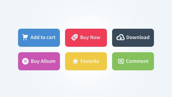
Icons and Images
With a good design and the size and color, if an icon or an image can be used on the button, then it appears easier to understand for the viewers. It can be seen that a call to action button with a picture gets more conversion rate. Make sure that the image clarifies the button’s meaning.
Be clear and direct
While designing call to action button, make sure that it is clear to the visitors. You should make them understand what they are doing. You can prioritize the buttons with the proper hierarchy or even using different color and size.
Once you have followed all the steps, remember to test them again and again. Ask any person from outside to review your call to action button, take their views and advice. Gather more and more ideas. Spend a good amount of time on designing this and give your website a new look and help your visitors to navigate easily.